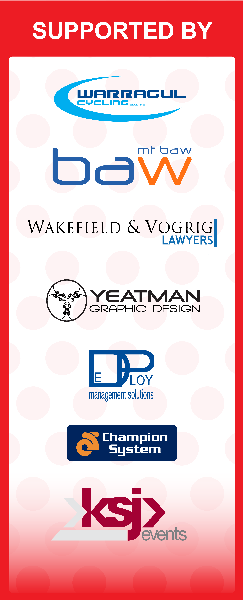
On Sunday afternoon I was contact by my cycling club’s Vice President regarding signage for next weekend’s Baw Baw Classic. She wanted to have the artwork for some gantry signs made up and need it for the printers on Monday.
I agreed to do this as if things worked out well I would be able to say I had designed the signs and at least 200 people will see them, possibly more if the start of finish lines get on SBS as it has the last couple of years.
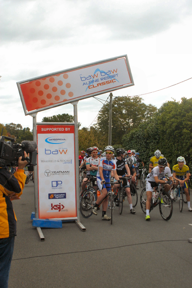
While driving back to my base in Melbourne, I was thinking about the work. I had photos of the signs from the last couple of years so no problems designing something to emulate previous years. My only concerns were that I would have to create a few of the sponsor logos from scratch.
I had already redrawn the Baw Baw Alpine Resort logo a few weeks back for incorporation into the race log and had a club logo and my business logo as ai files. The race director was able to give me a pdf of her logo which opened us as a vector in Illustrator. This left three logos to recreate: the Champion System logo, Deploy Traffic Management Systems and Wakefiled and Vogrig Lawyers.
I had cycling gear templates from Champion System so it was pretty straight forward to design their logo. It differs from the provided logo, but matches the one used on the signs.
The Wakefeld logo was also fairly easy to recreate. The black type was a standard Adobe system font. I needed to trace the blue type as I could not identify it. I was worried the “S” in lawyers was a bit wobbly, but looking at it 24 hours later, it looks acceptable.
The final logo for the traffic? management company posed the biggest challenge. I was unable to identify the type, but after visually examining other fonts I determined it was probably Helvetica, but vertically stretched with some weird assed kerning applied. The closet font to this on my computer was Arial. To get it to look like the font used I had to modify the tail on the “a”. The “g” I left as is.
Once I’d created the signs, I sent the ai file, with embedded logos, a pdf of the file and mockups to the VP. I’ll take some happy snaps of the signs (assuming everything goes to plan) when they are in use on the weekend.
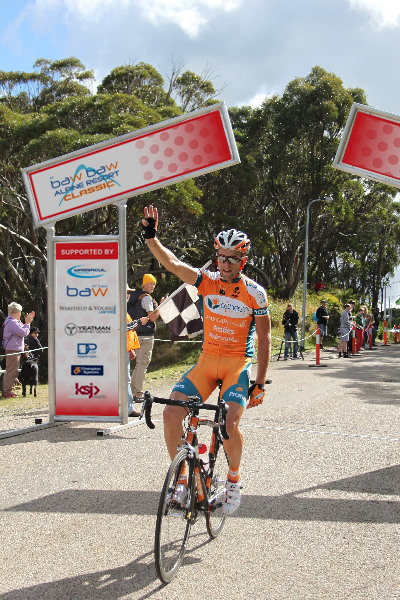
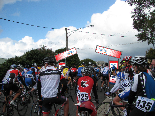
Okay, I’ve added photos of the signs in action. This year, the LHS and RHS versions appear not to have been printed so the overhead sign is the same on both the left and the right. The redrawn logos printed out very well.