Word must be spreading that I do websites as a couple of weeks ago I was approached by a local garden supply company that was looking to step into today with a website.
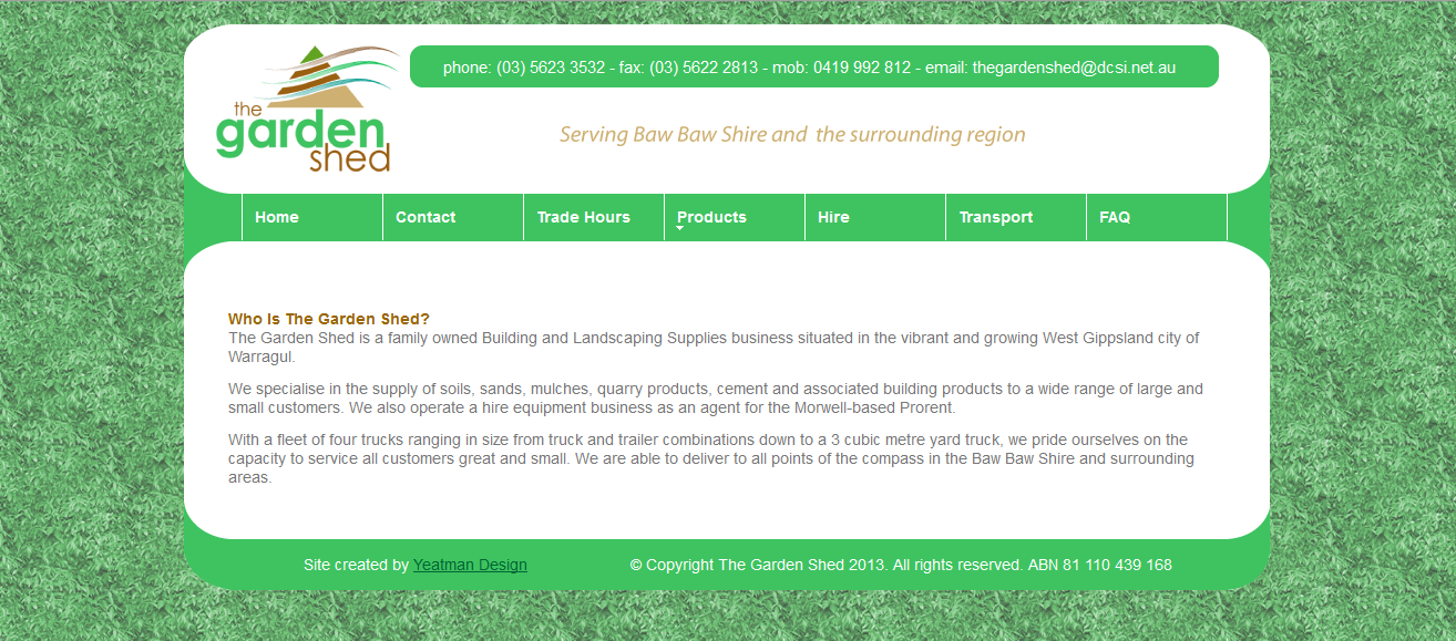
The client had a very clear idea of their site structure and was able to provide 99% of the copy as well as all logos and photography. The only photo taken here was of a shrub in the backyard which I used to create the seamless background.
With all resources provided to me, I had more time to spend on the design of the site and I think it is a big improvement on my first commission. Pleasingly, the look has wandered away a little from the others sites I have created. That is a good thing as I was beginning to think all of my sites would look the same: rectangular top banner, top or side links, (mainly) plain backgrounds and a gradient or two. This time around I have experimented with transparencies and curvy design elements.
The site look was created to resemble something like a competitor’s website, but I made damn sure it looks a whole bunch different as I do not want to infringe on design copyright. The only things I am needing to complete the site now are the USB stick full of photos and figuring out how to get Internet Explorer to show the link colours how I have coded them in CSS, not as that program’s default colours.
Perhaps, most importantly is that the only connection with cycling this site has is that the owner is a cyclist at my club.