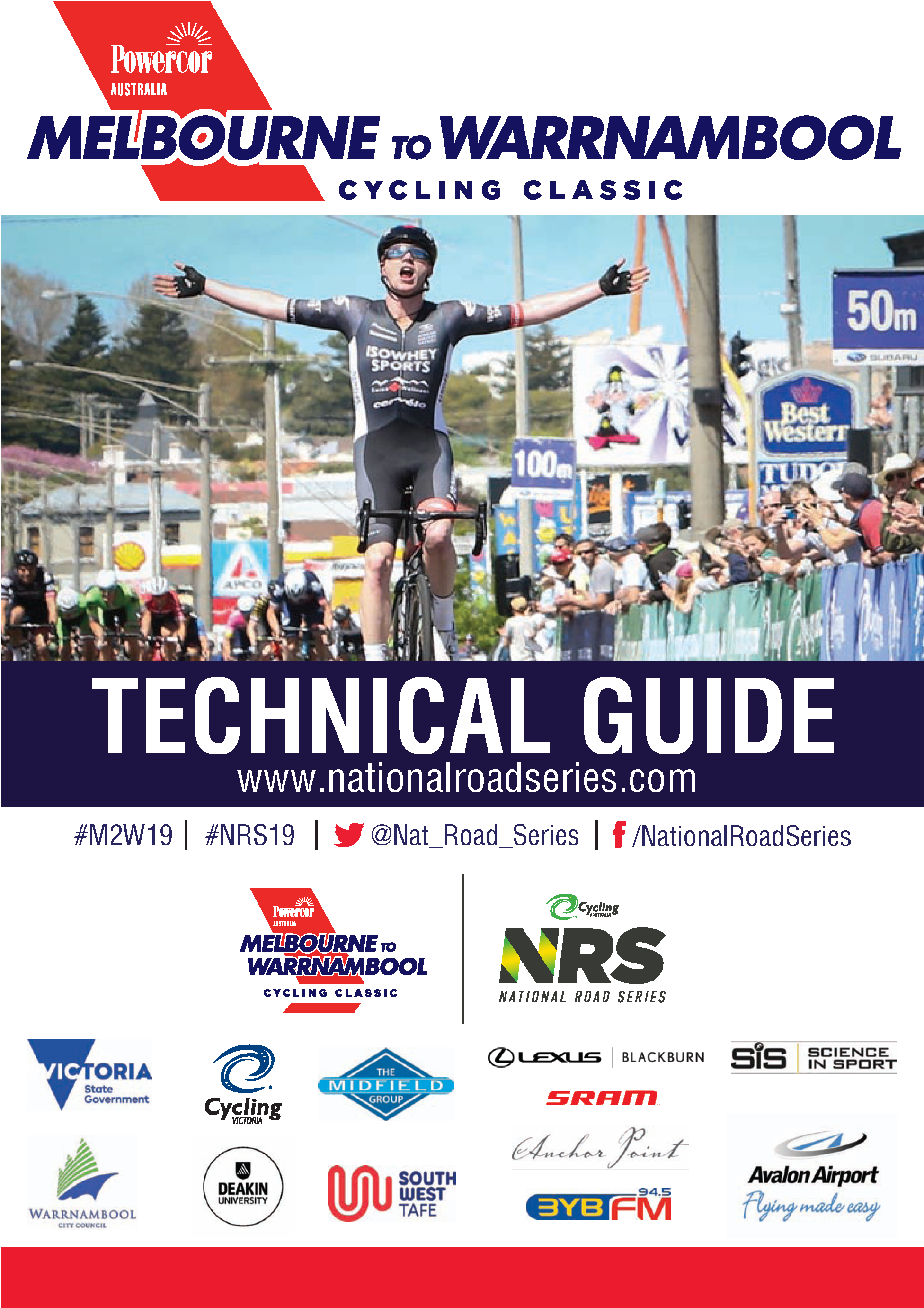
Wow. 18 months later and this is my next post. My day job and cycling appear to have been taking priority. in 2017 the guide was a hack job with lots of cut and pasted images from an export of the 2016 guide. In the interim, I learned how to import formatted tables from Excel and how to alternate the colours in rows or columns. The alternation was a basic little trick.

With more time to create the technical guide, I could format it properly and insert/create lots of tables, rather than pdf export images. I also had the time to convert all images from RGB to CYMK. Rather than cutting images out of the previous guide, I was able to design things properly. The front page was created in Illustrator and dropped into the InDesign project.
During this project I used “Dashboard” to plan and time tasks. I provided an estimate on time based on all materials being provided (copy, logos, photos) and without (or partially). I have further fine tuned my time estimates for brochure creation. With everything provided, it takes ~10 mins a page from start to final QA check. Without, it is ~20 minutes.

Throughout this project, I stayed in touch with the client via email and phone.
Having created the page template in 2017, the most time-consuming part this time around was formatting the race mocka and race entries. With the mocka, I needed to get it to fit onto a series of pages. For the race entries, I needed to source team jersey images, convert them and size them as consistently as possible before placing them into the document. Here jersey designs were inconsistent – some were photos and most were various template designs. That makes a designer groan, but we work with what we are given. With time, I could have created them all from scratch – that I did not have.
A few items I was asked to create from scratch. Non convoy detours and feed station maps were some of these. As neither copy, images or direction was provided little tasks like these can take longer than expected: find images, size appropriately, determine where cars are to travel to avoid the race as much as possible, document the routes to travel. Have this double checked after creation and amend as instructed.

This year, I designed the front and back pages in Illustrator, the social media informative footers, the race signs, the course elevation, the green and gold stripes on the NRS banner, the key for the finish line photo, the race number / transponder placement image and the directional arrows. I created a spreadsheet in Excel and then imported tables of the mocka, the sprint and KOM points and non convoy vehicle routes into InDesign. I tried this with the race entries, but it did not work (it looked bad). Some elements were ditched due to the need to apply style guide rules for logos.

With the exception of the winner photo on the front page and the Minister for Sport, all the photos, including the one in the front page NRS fade banner were taken by me with my own equipment.

The estimate for this project was 9-10 hours with logos, maps and copy provided. Without, I estimated 12.5 which was a fairly bad underestimate. What blew the time out was determining and documenting non convoy routes, sourcing satellite images of feed station zones, importing and them tweaking the race mocka and setting out the race entries nicely (in 2017 and in the 106 documents, I always felt this looked a bit cramped).


Changes after the client proof read the document were not billed. This is one thing that jars between my science background and graphic design. In science, I’d spell check and proof read documents. In graphic design, the client’s supposed to provide the copy and the designer is just supposed to whack in into the document as is, errors an all. I guess I value add here by correcting errors if I see them. Conducting quality assurance on a document of this size adds 2-3 hours to the project. Some clients would be willing to pay that, some would baulk.
Despite doing everything “properly”, the preflight feature of InDesign complained about non CMYK colour spaces in some imported tables and a number of low resolution images. The colours could be cleaned up with about an extra 90 mins of checking. That’s likely down to needing to prepare my Excel tabled in CMYK and not RGB (perhaps). The low resolution images were a result of needing to source them from the Internet myself and not having time allocated to recreating them in Illustrator.
At the end of the project, four files were provided. Two 2 up saddle stitch files (one with printers marks, one without), and two web suitable documents. One a page to a page, and the other in spread format

