Note to self, never submit a joke idea for a competition again. Read about my cycling club’s ‘design a new cycle kit’ competition here.
Rather than support a graphic designer who rides for the club and who has supported the club for the last 6 years by maintaining its website, it was decided to pay for the services of a graphic designer from elsewhere. One of the reasons for this was that competitions would only produce “a bunch of template” designs. Bah I say. Using a template is not my style and I would also have provided my services for free (it was a competition). So much being the winning (reduced to most popular in a straw poll) entry. I was looking forward to wearing a kit I designed and leveraging off it.
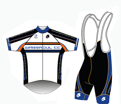
Our President launched into a big spiel about the design elements and how each met the brief. Standard fare for a designer in order to generate excitement.
So, here it is:

The orange is said to link to the current kit / club history. There are lines falling at an angle on the right of the mountains to signify the sun. The blue signifies the sky (not the blue in the old kit). The white sides and orange bands are high visibility elements (the club has a thing about bright colours and visibility – que the basketball game and the gorilla suit). The mountains represent how hilly Warragul is. (Eh? Isn’t it in a valley?). The pin stripes are there because the committee wanted some. The swoosh on the chest logo can also be interpreted as a road leading to the mountain. On the back of the jersey there are more lines (white with a gradient fading to black) at an angle that supposedly ads a slimming effect. There are also some low contrast downward overlapping triangles on the glute panel of the shorts.
Critique from me
First impression is I hate it. It may grow on me, but unless I get the promised free kit, I’ll be unlikely to adopt it.
The orange bands may be highly visible if you are expecting to see a cyclist on the road, but they are not slimming. The black abdomen will bulge into the white sides, creating a blubberfying effect. The mountains on the shorts look messy. The angled lines on the rear of the jersey will be bowed out when the pockets are full. Again, this will add to the visual volume rather than slimming the rider who is big boned.
UPDATE 08/05/2013: it cost the club $570 to get another designer to do the kit. Now I have a figure to work with when I’m doing the same thing for clients.
Musings
My biggest fear was that the design would bear a resemblance to one of my submissions and the designer would be plugging it as his work (that would have been a shit storm).
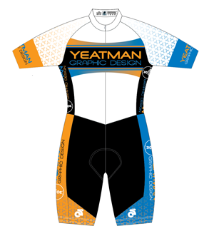
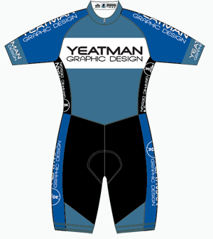
See my submissions below.

In the end, about the only thing retained from my submissions is the text logo element and at a stretch, the pin striping.
I will admit my first attempts at cycle clothing were pretty ho hum, but I think my recent goes have been successful. At any rate, I have ended up designing a couple of kits I will be wearing so I can say I designed them myself. I paid Cycling Victoria $50 and sponsored myself so I can wear my “corporate kit” whenever I choose. The registered design is a bit plain, but the whole point was to get my design company’s name across, and it achieves that.
If I continue with the blue kit, I’ll reduce the logos by around 80% so the edges are not lost by creases or the curve of the body.
For the 2014 season, assuming I have money (finances are getting really tight around here, what with my bike porn addiction and everything), I’ll register the more colorful kit. I may get a kit made up a bit sooner if I get a “real job” back in science as so far, many job application but no takers.