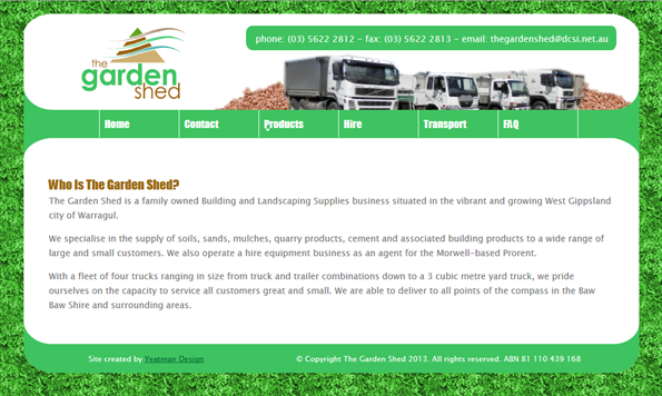
A garden supplies company approached us as they wished to develop a website.
After estimating the likely cost, approval was given to begin. Here the client had a clear idea as to site map and was able to provide 99% of site copy and all photos. This made the site development a breeze and greatly reduced costs.
A test site was uploaded to an online testing server in order for the client to gauge progress and provide feedback.
As a logo was provided, the site colours were based on those contained within The Garden Shed’s logo. The look of the site was achieved using transparencies and css styling. For the background, our web designer created a seamless image from a photo of a shrub in our car park which was then tiled.
The client was really happy with how the test site turned out. During this project, the client decided to move away from a shop front, so the website was no longer required.

The Garden Shed Website
