
Recently I decided to revisit my design of my cycling club’s jersey. The new design is bold, retains link to current kit, retains existing logo, stands out, can be used with black shorts and does not look like any other Victorian club’s kit. The orange colouring on the right hand side ads a high visibility element and the black tapering on the abdomen ads a slimming effect.
The club seems hell bent on getting a black based kit (nuts that my joke design was the most popular). As “they” say our current kit looks dated, making the new one black will ensure it looks dated pretty quickly as black kit is currently trendy. Creative Bloq recently posted on the biggest mistakes logo designers make. This is also applicable to fashion. What will be next year’s cycling kit trend be?
The design below
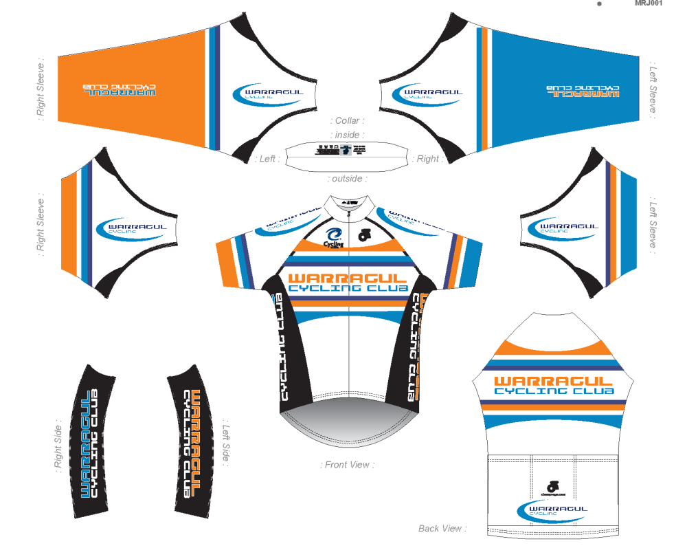
As of mid 2016, I still like the overall look of the above kit.