
Given I am a cyclist, I figure I may as well have a go at this. If I cannot whip up something professional, there is not much hope for me as a graphic designer I reckon.
The winning entry will receive $1000 and will feature as the 2012 UCI Track Cycling World Championship promotional poster distributed throughout Melbourne in the lead up to the event.
Four finalists will receive $500.
All entrants to the competition will receive a double pass to the opening session of the 2012 Track Worlds – Wednesday, 4 April from 3pm – and will be invited to a judging ceremony and exhibition, where all poster entries will be displayed and the winners announced. (They do say if your entry is judged to be crap, you do not get tickets. Guess that is why I did not get tickets.)
As the start of Feb is the end of term and I have 2 weeks off, I am thinking of working on this instead.
Initial Ideas
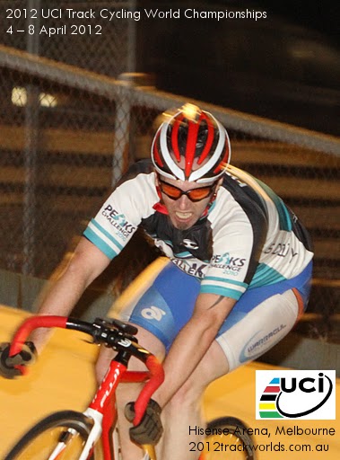
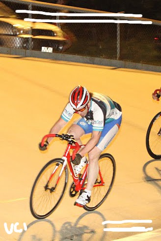
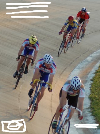
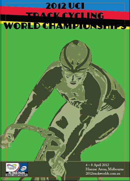
I am a fan of the first exploration. The second one is ok, but the main cyclist is a bit small. The third one would also make a good poster, but probably has too many elements for me to vectorise it in a decent time frame. Then again, I could stylise it by making it look simple. It would need to be brightened up. As there are five riders, I could give each of them a UCI rainbow colour…hmm, I am quite fond of exploring that further.
Stage 1 Mock up & WIPS
The plan is to use an art deco style of text for the headliner font and something more modern (or at least crisp and sans serif) for the location and website details.
The main image will be converted into a vector image and modified suitably to look retro. How I am to do this is still being pondered. Illustration style? Colours? Filter? Texture?
The rainbow colours, I may incorporate into the seating seen in the background.
I need to do some photoshop manipulation to get rid of the fencing and blurring first and perhaps turn the concrete surface into boards.
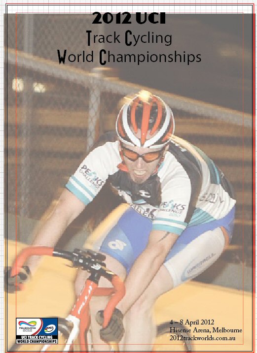
Final Poster
After not being too happy with the live trace of my source image, I kitted up and took some self photos. I chose the best one and placed it in illustrator.
I ditched the art deco for an art nouveau (inspired) style. I think the colours are better than the green version and it prints our acceptably at A3.
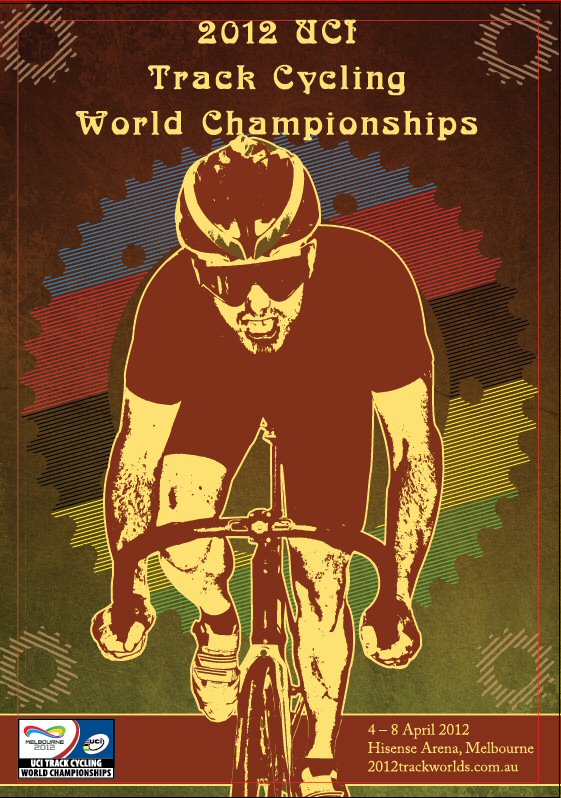
Argh. After examining the final print, I noticed one of the track cogs needs to be set to 75% opacity like the rest and the line art around the main image needs some tweaking. After that the poster will be submission ready.
Since then, my “art deco” skills have improved. See my Wedding Wrapping paper custom design.
Back