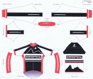
So, after getting the most votes for my joke design, it was now apparently a straw poll, so non binding. At my club’s committee meeting, many many suggestions on the design were raised. A really woeful design from our current clothing supplier was also shown. This design was a modification of the overall black design. It looked messy, had a scribble on it that granny could have done, and the cohesiveness with the shorts was well and truly lost. Check it out below.

On a positive note, the committee decided to keep the current logo (yay for not changing our branding too much).
I still like the original design I did so into the portfolio it goes.
